The Southwest commercial landscape is entering a new phase of architectural expression in 2026. After years of beige dominance, facility managers, architects, and property owners across Arizona, Nevada, New Mexico, and Southern California are embracing color strategies that balance aesthetic ambition with the harsh realities of desert climates. The latest trends reflect a sophisticated understanding of how exterior color impacts brand perception, energy performance, and long-term maintenance costs in one of the most demanding environments in North America.
This year’s palette movement is driven by three converging forces: the need for buildings to express corporate identity in increasingly competitive commercial corridors, mounting pressure to reduce cooling loads amid rising energy costs, and a design culture that finally treats the desert as a source of inspiration rather than a limitation to overcome. The result is a range of approaches that work with the region’s intense light, expansive skies, and dramatic geology instead of fighting against them.
Quick Answer
The strongest 2026 commercial exterior color trends for Southwest buildings are layered desert neutrals, earth-tone brand accents, and high-reflectance cool colors that reduce heat gain. Facility managers should choose palettes that hold color under intense UV, hide dust, support brand visibility, and meet energy or sustainability goals.
Key Takeaways
| Trend | Best Use |
|---|---|
| Desert neutrals | Large wall fields, multi-tenant properties, dust-prone sites |
| Terracotta and copper accents | Entries, canopies, wayfinding, brand moments |
| Cool reflective colors | Roofs, parapets, west-facing walls, energy-focused projects |
| Soft sage and blue-greys | Healthcare, wellness, office, and hospitality properties |
<!-- Arrow 1 -->
<g>
  <line x1="190" y1="90" x2="230" y2="90" stroke="#6c757d" stroke-width="2" marker-end="url(#arrowhead)" />
</g>

<!-- Earth Tones -->
<g>
  <rect x="240" y="40" width="160" height="100" rx="8" fill="#A0785A" />
  <text x="320" y="85" text-anchor="middle" font-family="system-ui, sans-serif" font-size="13" font-weight="600" fill="#ffffff">Earth Tones</text>
  <text x="320" y="105" text-anchor="middle" font-family="system-ui, sans-serif" font-size="11" fill="#f0e6dc">Terracotta, Sage, Rust</text>
</g>

<!-- Arrow 2 -->
<g>
  <line x1="410" y1="90" x2="450" y2="90" stroke="#6c757d" stroke-width="2" marker-end="url(#arrowhead)" />
</g>

<!-- Bold Accents -->
<g>
  <rect x="460" y="40" width="160" height="100" rx="8" fill="#C75B39" />
  <text x="540" y="85" text-anchor="middle" font-family="system-ui, sans-serif" font-size="13" font-weight="600" fill="#ffffff">Bold Accents</text>
  <text x="540" y="105" text-anchor="middle" font-family="system-ui, sans-serif" font-size="11" fill="#fceae5">Coral, Copper, Deep Red</text>
</g>

<!-- Arrow 3 -->
<g>
  <line x1="630" y1="90" x2="670" y2="90" stroke="#6c757d" stroke-width="2" marker-end="url(#arrowhead)" />
</g>

<!-- Cool Reflectives -->
<g>
  <rect x="680" y="40" width="100" height="100" rx="8" fill="#B8C5D1" />
  <text x="730" y="85" text-anchor="middle" font-family="system-ui, sans-serif" font-size="12" font-weight="600" fill="#2c3e50">Cool</text>
  <text x="730" y="102" text-anchor="middle" font-family="system-ui, sans-serif" font-size="12" font-weight="600" fill="#2c3e50">Reflectives</text>
  <text x="730" y="120" text-anchor="middle" font-family="system-ui, sans-serif" font-size="10" fill="#4a5568">Sky, Silver, White</text>
</g>

<!-- Arrow marker definition -->
<defs>
  <marker id="arrowhead" markerWidth="10" markerHeight="7" refX="9" refY="3.5" orient="auto">
    <polygon points="0 0, 10 3.5, 0 7" fill="#6c757d" />
  </marker>
</defs>

<!-- Label -->
<text x="400" y="175" text-anchor="middle" font-family="system-ui, sans-serif" font-size="14" font-weight="500" fill="#495057">2026 Southwest Commercial Exterior Color Spectrum</text>
Desert-Inspired Neutral Palettes
The foundation of 2026 Southwest commercial exteriors remains rooted in the landscape itself, but with a notable shift toward richer, more complex neutrals. Designers are moving beyond flat tans and generic beiges toward layered palettes that capture the subtle variations found in desert geology. Warm greiges that shift between taupe and soft grey depending on the time of day, sandy clays with pink undertones that mirror the region’s sandstone formations, and softened adobe whites that avoid the harsh glare of pure white are dominating new construction and repainting projects alike.
These nuanced neutrals serve multiple practical functions. They minimize the visual impact of dust accumulation, a constant concern during monsoon season and dry winter wind events. They also photograph consistently under the Southwest’s intense, high-angle sunlight, which can wash out cooler tones and exaggerate shadows on pure white surfaces. For multi-tenant commercial properties and corporate campuses, these palettes create cohesive streetscapes that feel intentional rather than accidental.
The key advancement in 2026 is the pairing of these colors with textured finishes and varied sheen levels. Matte body colors combined with low-luster trim in slightly darker values add depth without introducing high-maintenance gloss surfaces that show every imperfection. This approach aligns with our guidance on paint color matching, where achieving consistency across large surface areas and multiple application crews requires careful specification of both color and finish.
Bold Accent Colors for Brand Identity
While neutral bases dominate wall surfaces, 2026 is witnessing an unprecedented use of bold accent colors on architectural features, entry monuments, and wayfinding elements. Deep copper tones, burnt corals, and rich terracotta reds are appearing on canopies, column wraps, and lobby entrances from Phoenix to Albuquerque. These colors function as navigational markers in large commercial developments while reinforcing corporate branding in a region where landscaping alone often struggles to create visual distinction.
The boldest applications are appearing in entertainment districts, lifestyle retail centers, and corporate headquarters where competition for attention is fiercest. Architects are specifying these accents in durable fluoropolymer and ceramic coating systems that resist the rapid fading that plagued earlier generations of saturated colors in desert UV exposure. The result is a new confidence in color expression that was previously considered too risky for Southwest exteriors.
Property owners implementing these accents should coordinate with their coating contractor on coating selection to ensure the pigments and resin systems can deliver the specified color for the warranty period. Not all high-chroma colors are available in all coating chemistries, and matching brand standards across metal, stucco, and concrete substrates requires careful system specification.
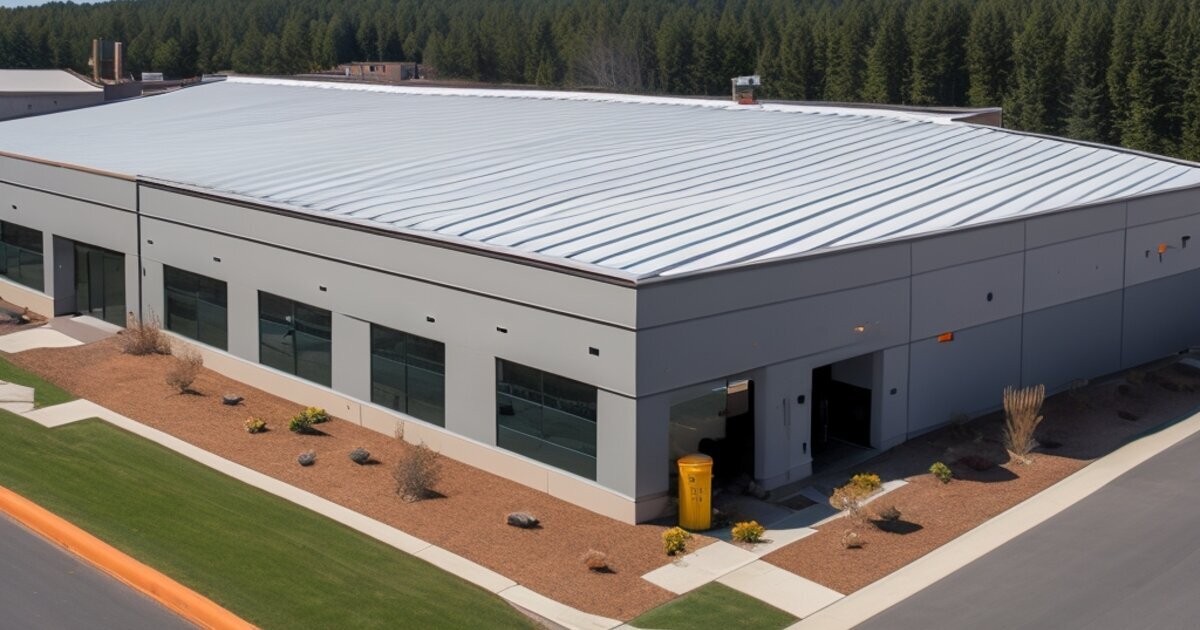
High-Reflectance and Cool Colors for Energy Efficiency
Perhaps the most significant trend in 2026 is the mainstream adoption of high-reflectance and cool-color coatings for commercial exteriors. Facility managers facing rising utility costs and increasing utility rebate requirements are specifying solar-reflective roof coatings and cool-wall systems that reduce heat absorption without sacrificing aesthetic goals. Modern cool pigments can deliver deep, saturated colors in blues, greens, and even charcoal greys while maintaining solar reflectance values above standard formulations.
For flat and low-slope commercial roofs, white and light grey elastomeric coatings continue to dominate, but the application scope is expanding. Building owners are now applying these systems to parapet walls, mechanical equipment screens, and parking shade structures to maximize the radiative cooling effect across the entire site. Our detailed guide to cool roof coating application covers the substrate preparation, product selection, and quality control processes that determine long-term performance in desert conditions.
The energy savings are substantial. Facilities that have transitioned to high-reflectance exterior coatings report cooling load reductions of 10–30% during peak summer months, depending on building envelope characteristics and existing insulation levels. When combined with energy-efficient coatings on walls and roofs, the cumulative effect can extend HVAC equipment life, reduce peak demand charges, and improve occupant comfort in perimeter zones.
Color Psychology for Different Facility Types
The application of these trends varies significantly by facility type, and smart facility managers are tailoring their color strategies to the operational and psychological needs of their specific building uses. Understanding how color psychology interacts with Southwest light conditions helps inform these decisions.
Healthcare and wellness facilities are gravitating toward sage-influenced neutrals and soft blue-greys that convey cleanliness and calm. These colors perform well under the region’s harsh sunlight without the institutional feel of pure white, and they complement the native landscaping that many medical campuses now emphasize for patient wellbeing.
Industrial and distribution centers are adopting earth-tone bodies with high-visibility safety accents in copper or deep yellow on loading docks, pedestrian crossings, and traffic control elements. The neutral bases help these large structures recede visually in residential-adjacent areas while the accents improve safety and operational efficiency.
Retail and hospitality properties are the most aggressive adopters of bold accent strategies, using color to create Instagram-worthy moments and clear district identity within larger developments. The key is consistency; a single bold statement wall or painted canopy reads as intentional, while scattered color applications can appear haphazard and detract from property value.
Office and corporate campuses are splitting between tech-influenced cool greys with minimal warm accents and biophilic palettes that draw directly from the surrounding desert. The latter approach tends to resonate more strongly with employees and visitors, creating an authentic sense of place that generic corporate grey cannot replicate.
Related Reading
- Coating Selection Guide
- Cool Roof Coating Application
- Energy-Efficient Coatings
- Color Psychology in Commercial Spaces
- Phoenix Commercial Painting Guide
Facility Manager Checklist
Before finalizing your 2026 exterior color specification, review the following items with your architect and coating contractor:
- Confirm solar reflectance requirements. Verify whether local energy codes, utility rebate programs, or corporate sustainability goals mandate minimum SRI (Solar Reflectance Index) values for roofs, walls, or both.
- Request accelerated weathering data. Ask your coating supplier for Arizona-specific fade and chalking performance data, not just general southern exposure results. Desert UV intensity and thermal cycling create unique stress on coatings.
- Evaluate dust visibility. View proposed colors on large sample boards at your actual facility. Light greys and soft blues show dust more readily than warm tans and earth tones in desert environments.
- Plan for substrate variation. Ensure your specified color is achievable on all substrate types present (stucco, metal panels, concrete, EIFS) or approve acceptable color variations in writing before work begins.
- Coordinate with landscaping and hardscape. Exterior color should be selected in context with existing pavement, signage, and mature vegetation. Colors that looked correct on a blank sample board may clash with red decomposed granite or existing bronze window frames.
- Specify sheen by exposure. South and west elevations may benefit from lower sheen to reduce glare, while north elevations can tolerate slightly higher luster for improved cleanability.
- Review warranty color change limits. Most coating warranties specify maximum delta-E color change values. Understand what visual difference this represents for your selected color before signing off on the specification.
- Schedule around monsoon season. Plan exterior coating application for spring or fall windows to avoid the humidity and wind-driven debris that can compromise finish quality during summer storm season.
Frequently Asked Questions
What exterior colors are trending for Southwest commercial buildings in 2026?
The leading trends are warmer desert neutrals, complex earth tones, selective terracotta or copper accents, and cool reflective colors that support energy performance without defaulting to plain white.
Which commercial exterior colors hide desert dust best?
Warm tans, clay neutrals, greiges, muted adobe whites, and earth tones usually hide dust better than stark white, black, cool grey, or saturated blue finishes in Southwest conditions.
Can dark brand colors work on Southwest exteriors?
Yes, but they should be used selectively and specified with UV-stable pigments or higher-performance coating systems. Dark colors absorb more heat and can accelerate fading, thermal movement, and maintenance demands.
Conclusion
The 2026 commercial exterior color landscape for Southwest buildings represents a maturation of regional design sensibility. Rather than defaulting to safe beige or importing trends from coastal markets, facility managers and architects are developing color strategies that respond to the unique light, climate, and geology of the desert Southwest. The combination of complex desert neutrals, confident brand accents, and performance-driven cool coatings offers a toolkit that addresses aesthetic, operational, and financial objectives simultaneously.
For facility managers planning a repaint or new construction project in the coming year, the message is clear: color is no longer just a design decision. It is an energy strategy, a maintenance decision, and a brand statement that will shape how your property is perceived for the next decade. The buildings that succeed in 2026 will be those that treat exterior color with the same analytical rigor applied to HVAC selection or roofing system specification.
If you are evaluating color options for an upcoming commercial exterior project, Moorhouse Coating provides color consultation, coating system specification, and application services across Arizona, Nevada, New Mexico, and Southern California. Contact our team to discuss how these trends can be applied to your specific facility and climate zone.